Every single widget type has its own graph intended to display key performance indicators that are easy to read. The preset widgets designed by DashThis are available with their own dedicated graph type but with custom widgets, you can choose which graph type you want to display your data.
Here are some tips below on how to choose one of our 9 graph type widgets. But first, here is a list of widgets that are available with dimensions and those without:
With a dimension:
- Pie chart
- Stacked columns
- List
- Multi-column list
Without a dimension:
- Trend
- Gauge
- Simple number
- Historic
- Year-over-year trend
1- Pie chart widget
2- Trend widget
3- Stacked Columns widget
4- Gauge widget
5- Historic widget
6- Simple Number widget
7- Multi-Column List widget
8- Year Over Year widget
9- List widget
1- TIPS ON USING OUR PIE CHART WIDGET
The pie chart widget displays data as sections in a circular graph. The size of each section is determined by the value of the metric and dimension you are measuring. You can keep the graph at a standard size or make the circle larger. Use this widget when you want to show your data results as a whole.
Not sure about using the standard circular graph? Not to worry, you can change this for a list format with or without a bar chart under the edit widget settings. Additionally, you can change the numeric format, add fluctuations, add totals, compare periods, and more.
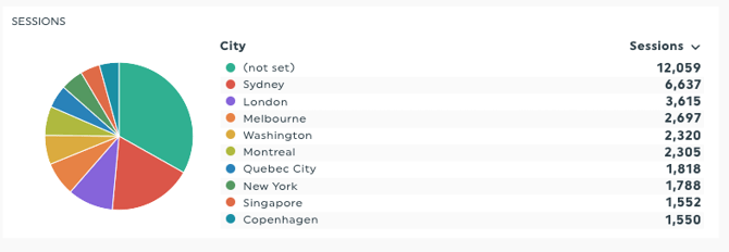
- The Pie Chart widget can only have 1 dimension
2- TIPS ON USING OUR TREND WIDGET
Similar to the stacked column widget, the trend widget can measure more than one key metric by dimension and is used to display the evolution of quantitative values over time. What’s nice about this widget is that you are showing more than just numbers, you are showing an evolution of the trend over time. You can change the style of your graph via edit widget settings, change the axes layout and add a maximum y-axis value.
- The Trend widget can only have 1 dimension
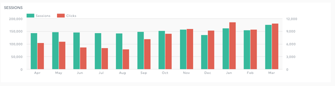
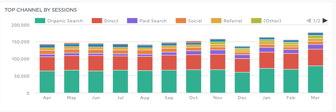
3- TIPS ON USING OUR STACKED COLUMNS WIDGET
This widget measures a key metric by showing a breakdown of dimension results in a single column and shows a column for every point in time. For example, let’s say you have a monthly dashboard, you can create this graph to measure the key metric ‘’clicks’’ paired with the dimension ‘’Ad Group’’. There will be a column for each previous completed month and each column will have the dimension results in their own designated colour. If you have access to the custom colour theme feature, you can change these colours under the data colours (primary and additional colours).
As a best practice, you should choose this graph when you want to show a general overview of smaller groups since larger groups may be hard to read. By default, the graph will display your results as an absolute value and the height of each bar will vary similar to a trend graph.
If you display your data in a percentage format, the bars in the graph will all reach the same height at 100% but you will still see the proportion of each group within the bar. It’s similar to comparing results in a pie chart though each column represents an individual pie chart.
- The Stacked Columns widget can only have 1 dimension
4- TIPS ON USING OUR GAUGE WIDGET
The gauge widget is an efficient way to quickly see how you’re performing in comparison to your goal. It enables you to present data on a relative scale, including peak values that can be adjusted to fit your goals.
This widget displays three colored zones: the primary colours are red, orange, and green. In this example, the red zone means that the results are far from the set goal, the orange zone means that you’re close to your goal but not there yet, and the green shows that the goal has been reached (good job!)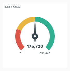
If you need to change the colours of fluctuation, our custom theme feature available for 10 dashboards or more will allow you to do this in only 3 clicks!
Learn more on the gauge widget.
5- TIPS ON USING OUR HISTORIC WIDGET
If you can’t decide between a trend widget and a simple number (seen in the widget types below), you can choose the historic widget.
Select a key metric and the graph will show you the evolution of your data over a defined period of time without the scale, but it also displays the raw data for the current period.
You can change the display of your graph via the edit widget settings, add, remove or edit the number value of your fluctuations. Ideally, keeping a visual graph displayed is better so you and your customer can see the trend of the key metric but if you need extra space, you can resize your widget only to display the number value.
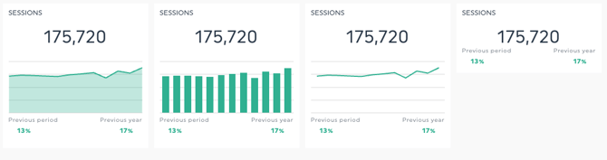
6- TIPS ON USING OUR SIMPLE NUMBER WIDGET
As its name says, this widget shows a key metric as a simple number. Unlike the rest of our widgets, the simple number displays the raw data which means there is no graph type available but you do have the option to add a filter to break down the results of your key metric. 
Use this widget to highlight an exact performance, such as the number of sessions, profits, expenses, goal completions, and so on.
7- TIPS ON USING OUR MULTI-COLUMN LIST WIDGET
Similar concept to our list widget below however, the multi-list widget will allow you to display multiple metrics by dimension all in the same widget. The list supports many different ways to render the multi-column metrics by showing fluctuations, totals, numeric values, compared to a past period, and more.
Take advantage of this widget when using a social media source like Facebook Insights, you can create your multi-list widget with a post image dimension, click on a row and it will bring you directly to the original post. Neat eh?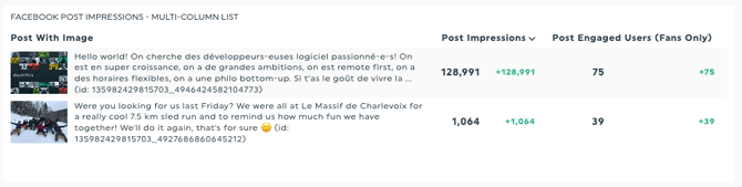
Why can’t I see all my campaigns/data in the table widget?
The widget will be created in a standard size, but don’t worry: you can expand the widget horizontally or vertically to display all rows with available data. Just hover over the widget, click, then drag the green handle downward or sideways to resize it.
- The Multi-Column List widget line limit is 3 pages PDF = 210 lines and 10 columns
- The Multi-Column List widget can only have 1 dimension
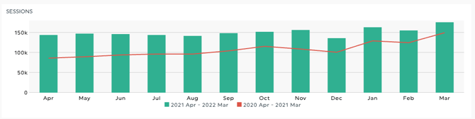
8- TIPS ON USING OUR YEAR-OVER-YEAR TREND WIDGET
The year-over-year widget is the big brother of the trend widget! They both have the same function which is to measure a key metric by dimension and compare the evolution of quantitative values for the current year and the year before that. At any time you can change the style of your graph via edit widget settings.
The biggest difference between the two (trend and yoy) is that the year-over-year trend widget will automatically display a comparison to the previous year consistently. Another difference is that you can only choose one metric for the year-over-year trend whereas for a trend widget you can choose more than one metric.
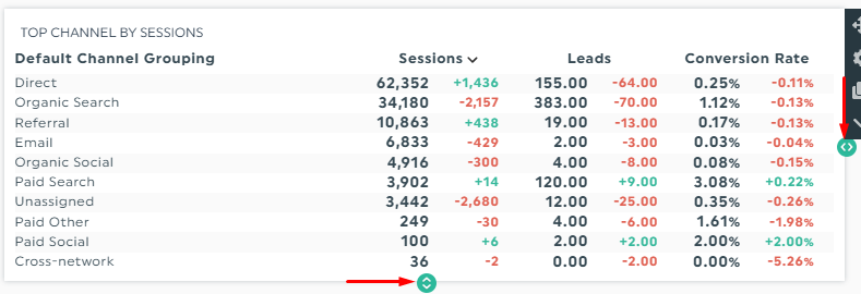
9- TIPS ON USING OUR LIST WIDGET
The list widget allows you to select a key metric by dimension and display the data set in a single-column list view. The list supports many different ways to render the single column by showing fluctuations, totals, numeric values, compared to a past period, and more.
Use this widget with a social media source like Facebook Insights, you can create your list widget with a post image dimension where you can click on a row and it will bring you directly to the original post, how cool is that?! 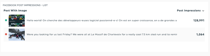
The widget will be created in a standard size but don’t worry, you can resize this from left to right or from top to bottom to display all the rows that have data available.
- The List widget line limit - 3 pages PDF = 210 lines and 10 columns
- The List widget can only have 1 dimension
Need help with your widgets?
Contact our Support Team here 💪🏼
What's next?
How to add a widget to your dashboard
How to edit widgets
How do I merge widgets?