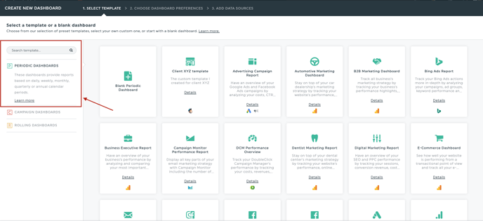
The Periodic Report is by far the most popular. This type is used to create reports for a calendar period, be it daily, weekly, monthly, quarterly or annually. It also allows you to browse through past periods, and is easily printable for record keeping.
Here is what a good looking Periodic Report should look like to your viewer:
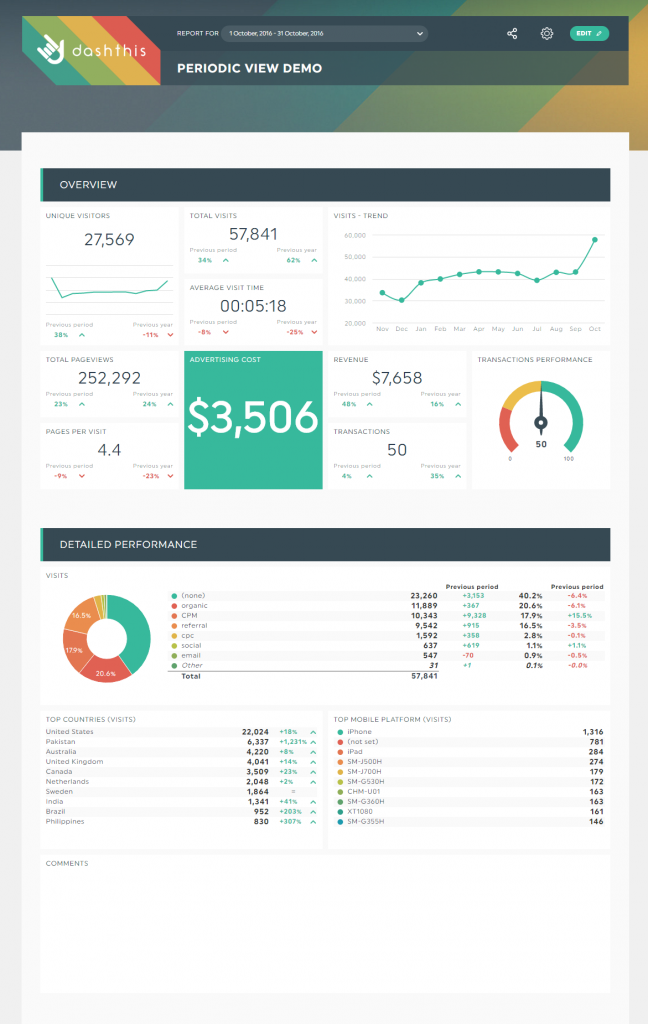
In this example, you have: a logo, a title, sections defined with headers, different types of widgets (6 different type for a more dynamic layout), widgets that have been modified within their settings, a gauge widget to follow goals and Comment box sections to provide information to the viewer. Most importantly, there are just the right amount of widgets: enough to show a comprehensive picture, but not so many that it would overwhelm your client.
Here is all the information you need to get the maximum out of this template:
When your KPI dashboard is in “edit” mode, you will see the Menu bar at the top.
The ideal, well-built periodic dashboard should include elements from each of the 3 buttons.
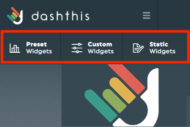
The “Preset Widgets” icon: this will allow you to choose among the preset widgets for the most popular Metrics and/or KPIs of your dashboard’s sources. The widget will, by default, be either a Historical widget or a List widget.
The “Custom Widgets” icon: this will allow you to create a custom widget of your choice using one of our 8 widget types. You will be able to customize your data using Metrics, Dimensions, Segments and various filters.
Here are our 8 custom widget types:
Pie:
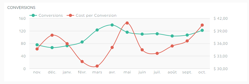
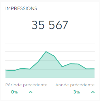
Trend:
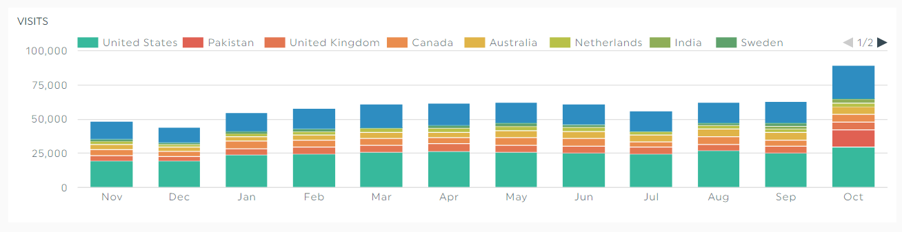
Stacked columns:
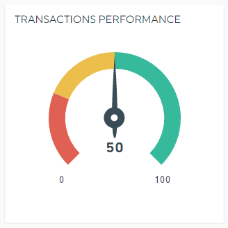
Gauge:
Historic:
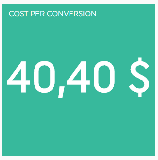
Simple Number:
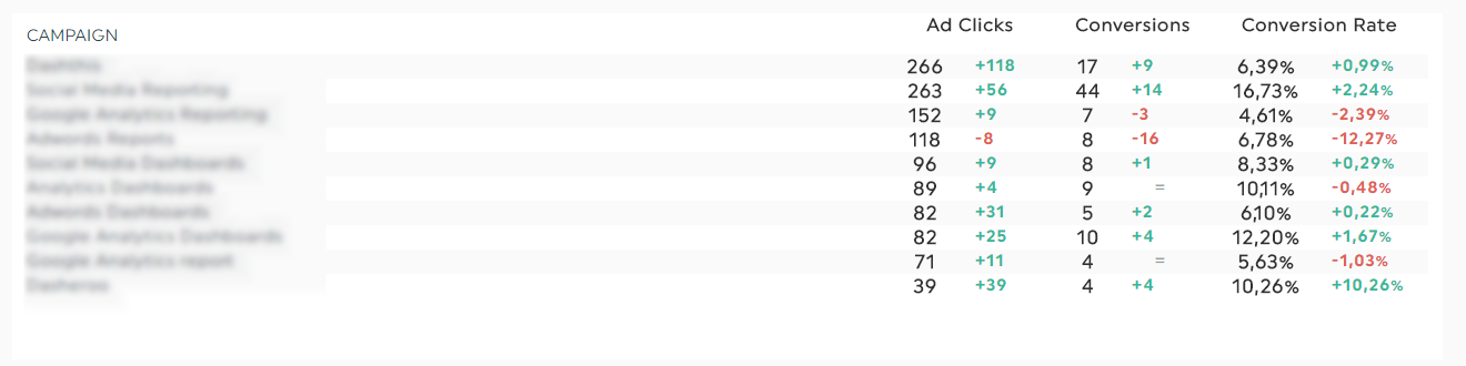
Multi-Column List:
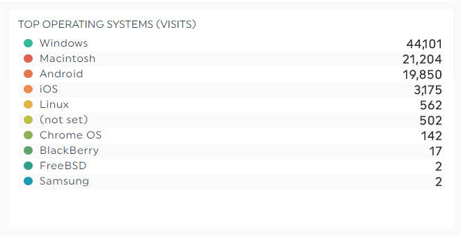
List:
The “Static Widgets” icon will give you the options of adding headers, comments, CSV file data, and editable number widgets.
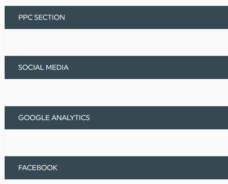
A header will allow you to insert a bar to create separation within your dashboard. You can name this bar in order to identify the section below, from the type of data you are sharing (ex. SEO, PPC, Social, etc.), to even the name of the integration itself.
Example
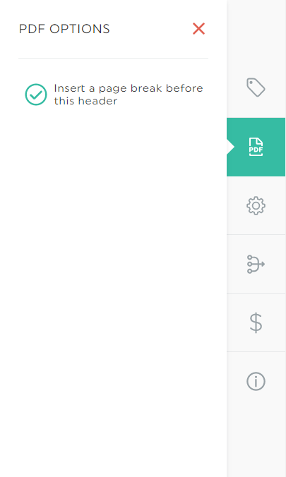
The header also offers you the possibility of putting a page break in the event that you convert your dashboard to a PDF document.
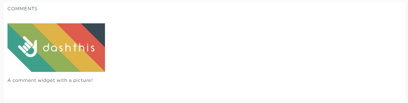
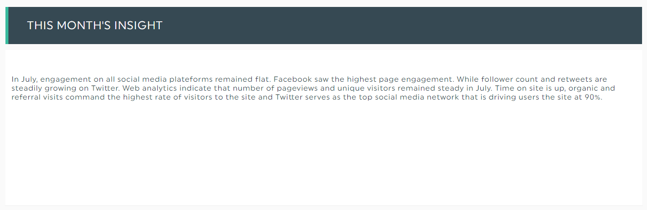
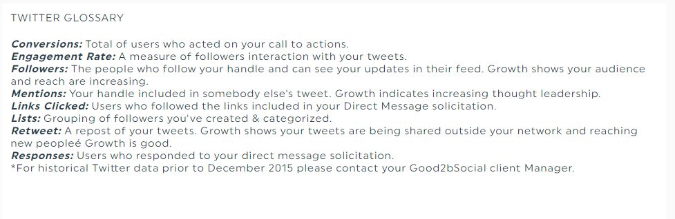
A comment will allow you to insert a text box in a dashboard, which is super useful for many reasons! First, this is the way to go to insert images in your dashboard. Second, this is also where you can provide your client with important information such as, insight on the last completed period, or perhaps why you used this specific KPI. If the client isn’t familiar with the metric, you can even insert its definition here. Basically, this is the place where you can put information that plain data cannot express.
Image
Insight
Metric definition
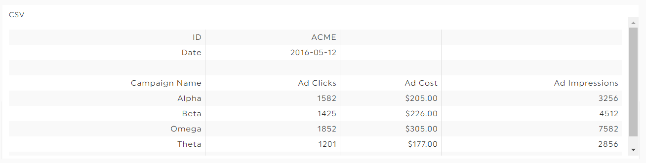
The simple CSV is one of the two options you have to include data that does not come from one of our built-in integrations. The other option is the CSV Files Manager. The CSV is a very simple widget, created only to display a CSV file in a table-like format. You can read this article to know how to create them.
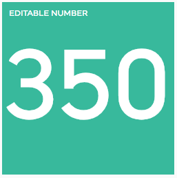
An editable number is pretty easy to understand: it’s the widget that allow you to manually write numbers in your dashboard. Easy as 1, 2, 3!
Now, it’s your turn to have some fun with this!