When you create a new dashboard, you can choose between three different types. One of your choices is the rolling dashboard; its main particularity is that it shows your data on an ongoing basis.
Therefore, the timeframe isn’t set in stone like periodic dashboards which are from one particular date to another (i.e: 1st to 30th of November).
The goal of a rolling dashboard is to follow your performances on an ongoing basis, validate the impact of your actions quickly, and observe tendencies.
1 – Time Period
The rolling dashboard measures your performance over a particular time period, and each time period includes three specific date ranges. All three of these date ranges are displayed in your widgets so you can follow your performance.
5 time periods are available:
- Short (Yesterday, last 7, and 15 days)
- Medium (Last 7, 15, and 30 days)
- Long (Last 7, 30, and 90 days)
- Biannual (Last 30, 90, and 180 days)
- Annual (Last 30, 180, and 350 days)
The basic time unit for a rolling dashboard is not the usual weeks or months; the time period is determined by taking the present day as a starting point. This means that the data that corresponds to the last 7, 15, and 30 days (for example) will change every day.
For example, if you create a rolling dashboard on March 15th, and select the Short time period (Yesterday, last 7 and 15 days), the data displayed for Yesterday will be the data for March 14th. If you go back to your dashboard on March 16th, the data displayed for Yesterday will be the data of March 15th, and so on.
The data corresponding to the three date ranges within each time period will be displayed in every widget you create. This way, you can follow the trend of your performance over the period of time you’ve chosen.
2 – Widgets Available
Two widget formats are available, rolling widget and rolling list.
2.1 – Rolling Widget
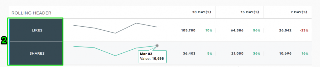
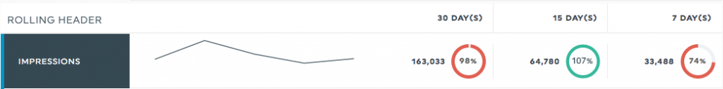
The rolling widget has 5 parts, from left to right: the metric name (#2), the graph (#3), and three columns (#4). Each column has two sections: numerical value (#5) and percent (#6). The header (#1) is not a part of the actual widget, but we suggest you add it for a better understanding of your data.
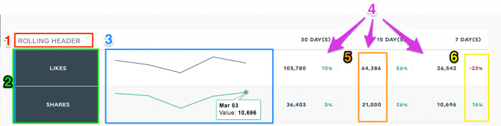
The Header
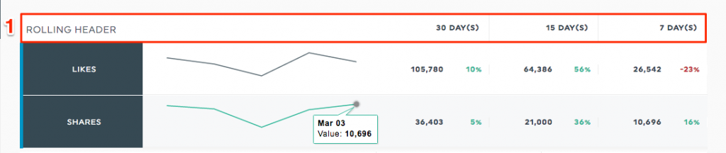
As mentioned above, the header (#1) is not a part of the widget, but we suggest you add it. The column titles (30 day(s), 15 day(s), and 7 days(s) in our example) belong to the header and not to the widget; they do not appear automatically when you create a widget. Adding a header will make the widget clearer.
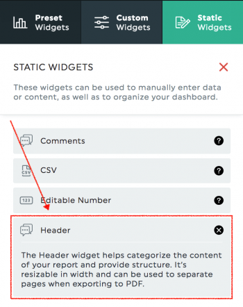
To add a header, click on the icon Static widgets, located in the top left corner of the screen in edit mode, and choose Header. You can position the header where you want in your dashboard.
The Metric Name
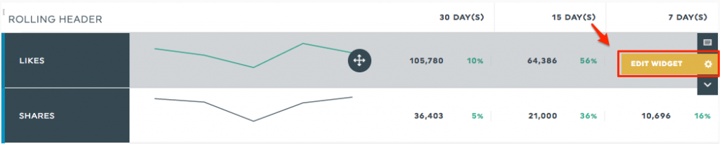
The first part of the actual widget, on the left-hand side, is the metric name. When you create the widget, there is a vertical blue line on the left side of the metric name. You can change the colour in the Edit widget panel, under the section Visual Display. These colours have an organizational function; you can use them to create groups or categories, and quickly identify to which category the widget belongs.
To change the colour, hover over the widget, and click on Edit widget, on the right-hand side of the widget.
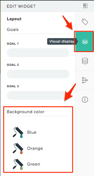
Then, click on the section Visual Display in the panel
The Graph
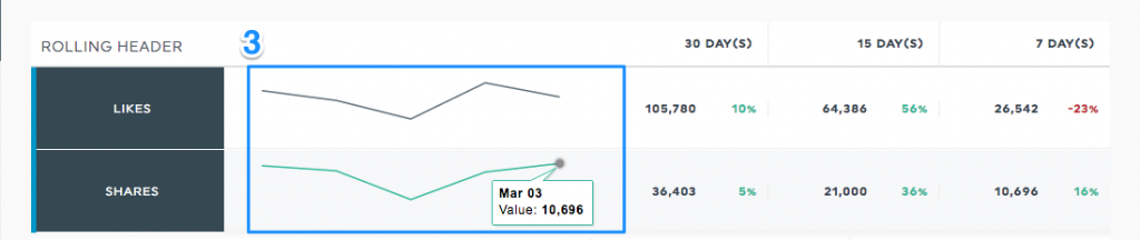
The graph shows the metric’s performance trend for the entire time period you’ve chosen. For example, if your time period is Medium (last 7, 15, and 30 days), the graph will show the trend for the past 30 days.
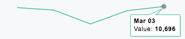
When you hover over the graph, tooltips containing a date and a value appear along the graph. The points at which these tooltips will appear along the graph are dependent upon the smallest time unit of your time period.
For example, if you have the time period Medium (last 7, 15, and 30 days), the tooltips on the graph will show data at 7-day intervals. If you choose the option Annual (last 30, 180, and 365 days), the graph will show data based on a 30-day interval, because the smallest time unit is 30 days.
Also, the value you see in the tooltip is the data gathered for a specific date range. The date range in question starts with the date seen in the tooltip, and ends X number of days later (X being the shortest time unit shown in your dashboard). In our example, the first tooltip shows March 3rd. It means the value displayed corresponds to the data gathered for the time range March 3rd – March 9th, our example being based on a 7 days time range. The next tooltip would show the date Feb 24th, which means the data gathered corresponds to the time range Feb 24th – March 2nd.
The Three Columns
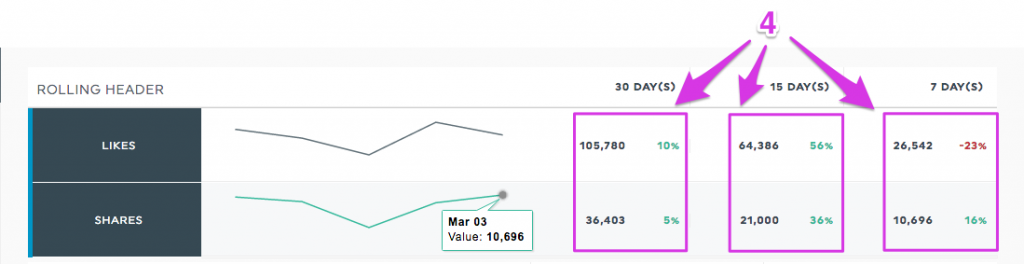
Every widget has a column for each of the date ranges included in the time period you’ve chosen.
Each column is divided into two sections: one displays an integer and the other displays a percent value.
The Integer
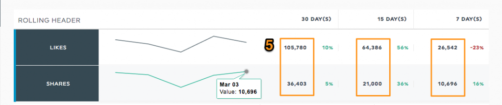
The integer shows the data’s value for that particular date range.
The Percent
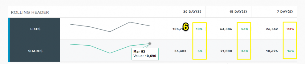
The second section contains percentages. These show how your numbers have changed in comparison to the previous period. For example, under the 7 day(s) section, the “likes” shown in our widget have decreased by 23% in comparison to the previous 7 day period. In the 15 day(s) section, however, the “likes” have increased by 56% in comparison to the previous 15 days.
It’s possible to replace the percentage value by a goal instead, in order to see where your current performance stands.
In order to add a goal, open the Edit widget panel, and go under the section Visual Display.
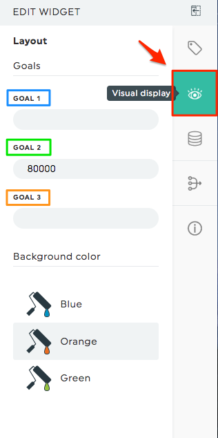
Goal 1 will apply to the longest time range. In our example, it would be to the 30 day(s) period. Goal 2 corresponds to the mid-time range (here the 15 day(s) period) and Goal 3 to the smallest time range, here the 7 day(s) period.
2.2 – Rolling List
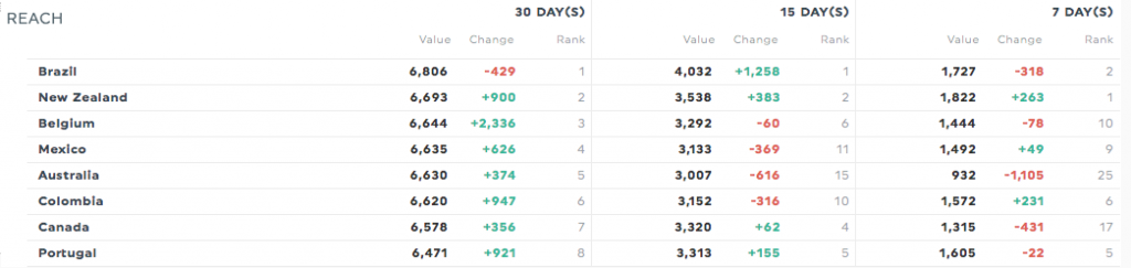
The rolling list has a simpler structure than the rolling widget. In addition, the header is a part of the widget, so you don’t have to add it manually.
The values of the chosen dimension appear on the left-hand side of the widget and the data is displayed on the right side. There are three columns, one for each of the period’s date range. Under each column are three sections: Value, Change, and Rank.
The value is the data for the corresponding period of time, the change is the evolution of the data in comparison to the previous period of time of the same length. For example, in our widget, there are 6,806 peoples reached in Brazil in the past 30 days, and this number has decreased by 429 people in comparison to the previous 30 days (even if this period is not shown in the graph). The last section Rank shows the rank of the value and its evolution over the selected time units in your dashboard.
Still have questions on the rolling dashboard? Contact our support team!