Depending on the type of dashboard and the type of period you're looking at, you're going to have different fluctuations data available.
4- Flexible periods
1- Default Comparison
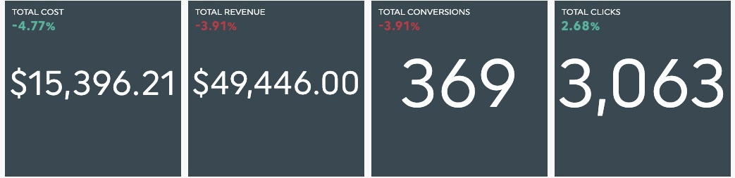
By default, some widgets in your periodic dashboard will display previous periods' fluctuations data.

If that is not the case, you can manually add the comparison column or even remove it by editing your widget.
- Hover over your widget.
- Click on "Edit Widget" in the menu.
- Go into the "Data Display" section.
- Check the "Show Fluctuations" box.

The fluctuations data will automatically be displayed with the right colour and symbol depending on the calculation.
- If your data is increasing from one period to another, the fluctuation will likely be green with a "+" symbol in some widgets.
- If your data is decreasing from one period to another, the fluctuation will likely be red with a "-" symbol in some widgets.
However, some KPIs can be considered as "reversed", such as "Cost" KPIs.
For these types of KPIs, an increase is usually bad news. Therefore, the fluctuations will be reversed as well so that an increase is displayed red, and a decrease is displayed green.
2- Types of fluctuations
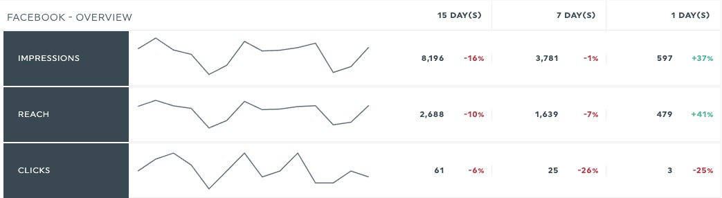
There are two main types of fluctuations available in DashThis: "previous period" and "same period last year". Depending on the time period chosen for your dashboard, those fluctuations won't compare with the same period ranges.

- For daily dashboards, "Previous Period" will show the "Previous Day" data and "Same Period Last Year" will show the "Same Day Last Week" data.
- For weekly dashboards, "Previous Period" will show the "Previous Week" data and "Same Period Last Year" will show the "3 Last Weeks Average" data.
- For monthly dashboards, "Previous Period" will show the "Previous Month" data and "Same Period Last Year" will show the "Same Month Last Year" data.
- For quarterly dashboards, "Previous Period" will show the "Previous Quarter" data and "Same Period Last Year" will show the "Same Quarter Last Year" data.
- For semiannual dashboards, "Previous Period" will show the "Previous Semester" data and "Same Period Last Year" will show the "Same Semester Last Year" data.
- For annual dashboards, "Previous Period" will show the "Previous Year" data and "Same Period Last Year" will show the "Previous Year" data also.
You can choose among those two types of fluctuations in some widgets, and even display both of them in your widgets.
Simply edit your widget and go in the "Data Display" section.
3- Fluctuation formats
You can also choose different formats of fluctuations in order to display your data the way you want to.
- Absolute Value will display the exact number of points you gained or lost between the two periods.
- Percentage will display the same variation brought back in percentage.
- Compared Period Value will display the value of the comparison period (previous period or same period last year).
4- Flexible periods
When you use a flexible period, comparisons are always based on the entire previous period, not just the same number of completed days.
This means that if you select This month, your data will include all completed days of the current month and compare them to the full previous month.
This behaviour applies to all displayed periods, including yearly, quarterly, and monthly, except when using the “Fixed period” option within flexible periods, where you can define a specific date range. This means that the previous period represents the same number of days right before the period you selected in your dashboard.
5- Notes
For campaign and rolling dashboard types, the fluctuations are displayed by default and cannot be removed since they are an essential part of these dashboards allowing you to compare multiple periods and even custom dates between them.