Due to data sampling or data taxonomy, Google Analytics can send different data depending on the type of widget you are creating.
Table of content:
1 - Data Sampling
When too much data is encountered, Google Analytics tends to apply sampling in order to reduce the number of data to interpret and to give you an accurate representation of your results.
- For Google Analytics standard users, the threshold at which data sampling is applied is 500k sessions at the property level
- For Analytics 360 users, the threshold is 100M sessions at the view level for the date range that is being used.
When this is the case, you'll see it indicated in your Google Analytics account:
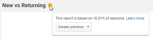
Unfortunately, the same rules are applied through the Google Analytics' API, which is why your widgets in DashThis can't display 100% of your data when it is sampled.
If you want to avoid your data being sampled, we recommend you to try to shorten the date range of your report, or to reevaluate the way you structured your Google Analytics views in order to reduce the quantity of data contained in each property.
You can learn more on data sampling by reading Google support article.
2 - Data Taxonomy
When it comes to demographics reports, Google Analytics tends to apply data taxonomy in order to give you an accurate representation of your total results and the demographic breakdown.
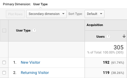
Indeed, "a single session [or user] can be classified in multiple categories, and as such, can be counted multiple times in the metrics." For example, a user classified in New Users can also be classified in Returning Users if he came back a second time in the same session.
However, even though the same user is counted in two categories, it is counted only once in the total at the top of the column.
This data taxonomy is applied to the following demographic reports:
- Age
- Gender
- Interest: Affinity Category (reach)
- Interest: In-Market Segment
- Interest: Other Category
- User Type
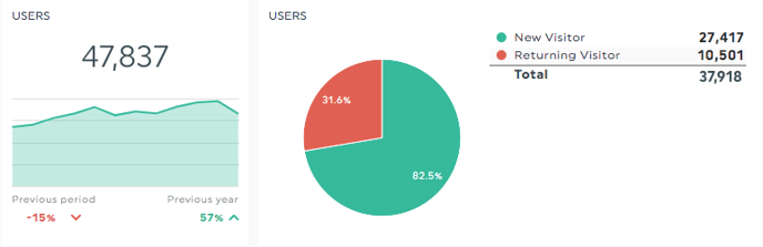
Back in DashThis, if you use one of these dimensions in a Pie/List widget, you’ll notice that the total doesn’t always match the total you see in Google Analytics, or in a Historic widget for the same metric.
The result in your Historic widget represents the Total Sessions or Total Users that you had during a specific period. While the Total line in your Pie/List widget is the sum of all the lines in your widget, which is used to calculate the % repartition in your Pie.
You can learn more on data taxonomy by reading Google support article.
3 - Data Thresholds
When creating widgets with Google Analytics demographic dimensions (Age, Gender or Interests), it is possible that your widget shows no data or N/A.
This is because Google applies thresholds in order to prevent companies inferring the demographics or interests of individual users.
If your account doesn't have enough data, some data may be withheld preventing DashThis to pull data in your widgets. As Google states, "these thresholds are system defined, and you cannot adjust them" unfortunately.
You can verify in your Google Analytics account if a threshold has been applied to your data by going in the related report. You'll then see a notice below the report title.
You can learn more on data taxonomy by reading Google support article.