The editor mode is where the magic happens. This is where you create and edit your widgets; this is the moment to combine aesthetics and efficiency so that your client gets to look at a pleasant yet professional dashboard.
Let’s talk about the header first, since it’s the first thing your client sees. We’ll keep the widgets for the second part.
1 – The header
1.1 – The logo
Start your dashboard creation off on the right note, and make it your own: add a title and a logo that matches either your or your client’s brand!

To add a logo to your dashboard, click on the “Add a logo” placeholder at the top left of your dashboard. There, you’ll probably need to upload your logo into DashThis. To upload a new logo, click on “Add a new image” and select the logo’s file.
Once this is done, select the part of the image that will appear on your dashboard.Since the logo’s space size is 250 x 125 pixels, you’ll only be able to select a part of the image fitting into this space.
To learn more on the specificities of adding a logo, you can read this article.
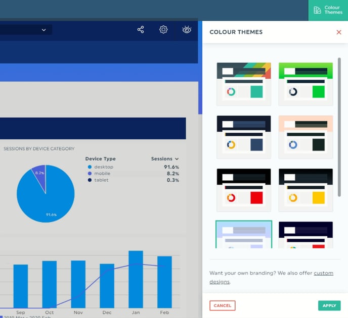
1.2 – The colour theme
By default, the DashThis theme is applied to your dashboard. But a lot of other possibilities are available under the "Colour Themes" panel.
These colour themes can help you customize your dashboard according to your brand or your clients', or just make it look more neutral depending on your needs.
You want to get further and deliver the WOW effect with your dashboard? We can create a fully customized design according to your brand chart.
1.3 – The time period
The header displays the time period reflected in the dashboard’s data. The format of this time period changes depending on your dashboard type.
If your dashboard is a periodic one, you’ll find a drop-down menu containing the previous periods (the length of time depends on what you’ve already chosen… be it weekly, monthly, etc.). By default, the dashboard is set to the last completed period. If you want to have a look at previous ones or see the current state of the on-going one, open the drop-down menu and choose the desired period. The dashboard will refresh itself automatically.
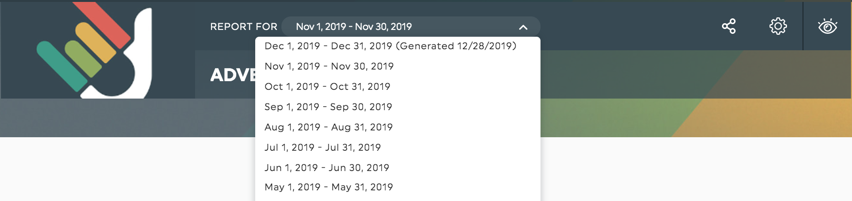
In the case of a campaign dashboard, the header shows the campaign dates as well as those of the compared campaign, if you’ve chosen one.
As for the rolling dashboard, this one tracks your performance on an ongoing basis, the header doesn’t show any time periods. Instead, you’ll find specific dates directly in your widgets.
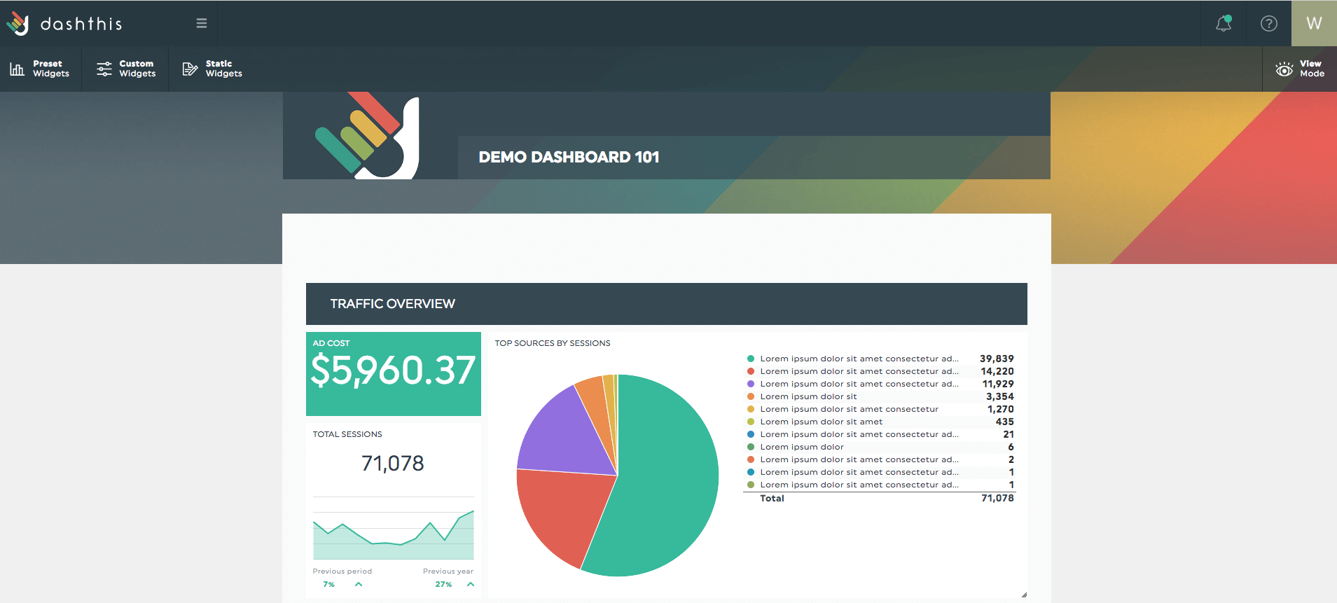
2 – The widgets
2.1 – Create
A widget is the element that displays data. It can be a graph, a comment box, a gauge, etc. The widget creation starts at the top-left corner of the screen, with the three drop-down menus. You can choose between preset, custom, and static widgets.
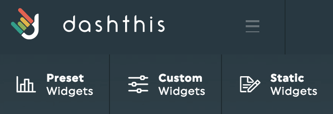
The preset widgets are metrics and/or KPIs that are the most popular for the integration(s) you’ve connected to your dashboard. By default, these will be either historical or list widgets.
The custom widgets offer you up to nine widget types to choose from, such as a pie, stacked columns, gauge, or other. We suggest you vary the types of widgets in your dashboard in order to create a diversified and visually appealing layout. You can learn a bit more about the types of widgets you can create in our article here.
The static widgets give you the opportunity to add other pieces of information, such as comments, editable numbers, headers to divide your dashboard into sections, or CSV file widgets.
Pick the type of widget you want, select the metric (and the dimension and/or segment, if applicable), click Save, et voilà! Your widget is now in your dashboard!
Please note that the options available in each drop-down menu will vary depending on the integration(s) in use as well as on the type of dashboard you choose.
2.2 – Edit
When hovering a widget, you have different options available.
![]()
Move: Once a widget is in your dashboard, you can move it around. Just hover over the widget you want to move; and select the drag&drop icon before moving the widget around.
Resize: You can resize some of your widgets, depending on what type they are. When you hover over the widget, use the green circles containing white arrows appear on the edges. Remember that resizing the widgets could change the position of the widgets around it.
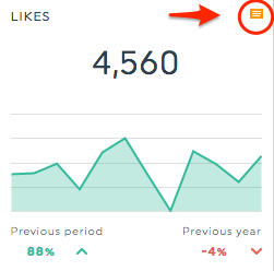
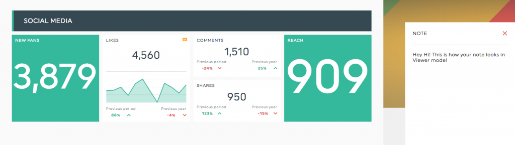
Note: You would like to give your viewer some additional information about the data displayed in your widget? Add a note to your widget, and an orange icon will appear in the top-right corner of the widget when in Viewer mode. The viewer can click on it, and the note will appear on the right side of the screen in a separate panel.
Edit widget: If you click here, the Edit widget panel will appear on the right side of the screen. Wanna change an integer for a percentage? Or include both? How about incorporating a markup to your cost widgets? All these options – and more, of course! – are available in this panel.
Refresh data: Data in your widgets are imported every day, and for some integrations even when you open your dashboard. However, clicking on “Refresh data” will once again display the newly imported data in your widget.
Delete: Here you can remove a widget from your dashboard. Remember that once it’s gone, it’s gone forever. You will need to recreate it if you change your mind.
Now that you know how to edit a dashboard and its widgets, you can have a final view of your splendid work by clicking on the View mode icon, on the top-right corner of your dashboard in order to see it in the eyes of your clients.